First up, my favorite of all the anthro looks:

I'm SO in love with this look I may have to try to recreate it for myself. The reason this look works- polka dots and a bright floral is twofold and it mostly has to do with the dots. First, the polka dots are black on white- a nice neutral backdrop for the brightly colored cardigan. Second, the polka dots are small. From a distance, this dress will not even appear to be a print and up close, the dots are still small enough that they complement the cardigan rather than compete with it. If the dress was a large polka dot print, then we'd have a problem. The large dots and the large floral print would fight to be the star of the outfit, but because these dots are dainty, they work perfectly with the bright flowers on the cardigan. Finally, this outfit would not be nearly as successful if the accessories didn't help to create a very neat and polished look. The trim ankle-strap shoes and especially the belt cinching in the cardigan both say to the world, "This look is intentional." An open cardigan or even one that is buttoned, but not cinched with a belt might give the impression that the lady wearing this outfit was merely a little chilly and grabbed the closest thing to her to warm up a bit. Catch my drift?
Moving on...

This outfit is successful for three main reasons: 1.) The prints are very different in size which helps them to complement each other rather than compete with each other. 2.) While they are very different in size, they are extremely similar in color scheme- Red and white skirt, red and white top. 3.) Finally, they work because the skirt print is geometric and the top print is not. Complementary contrasts are key (say that one five times fast)! Vertical stripes with horizontal stripes is not such a great idea, but stripes with flowers is fabulous. Fluid or abstract prints complement linear or geometric prints- are you starting to get the idea? Ok, back to my first point- the difference in the size of the prints. BE CAREFUL with this one. The size of the print on the skirt is rather large, even a tad exaggerated but it is NOT "busy." The print on the top is "busy" but because it's so much smaller, it's not so overwhelming. Be careful with very "busy" prints not to let them overwhelm the outfit or the person wearing the outfit. Have you ever felt like an outfit is wearing you, not the other way around? A print that is too busy and too large sometimes has that effect.
Next!

This is a perfect mix of prints for the beginner- someone who wants to try the trend but isn't willing to go all-in. The floral print on the belt is barely even noticeable, especially against those plaid walking shorts (which I am in LOVE with, btw). Once again, I'd like to point out that this works because one print is larger than the other, but they remain in the same color scheme. And yet again, the cinched belt look is ALWAYS polished and put-together, so it's very clear to the outside world that you have made a choice to mix these prints together.
Almost done...
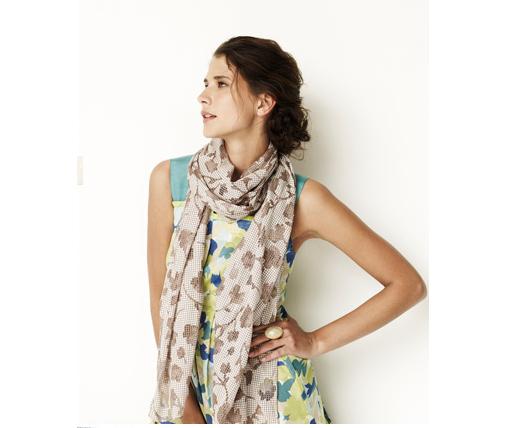
This is another good look for the beginner because a scarf is totally non-commital. If you chicken out halfway through the day, you can just take it off. The same can't be said for your skirt or top, right? This is also a good choice for the beginner because these prints are almost identical, it's only their color scheme that has changed. And while the top is bright and multi-colored, the scarf is completely neutral- beige with more beige is still beige. And beige goes with everything.
Last one!

By now you should be totally schooled in the ways of mixing prints, so leave me a comment and tell my why this last one works. Correct answers will win... ummm... my undying devotion and respect. But seriously, you can figure it out, so do it. Better than leaving a comment would be sending me a picture of you in an outfit with mixed prints that I'll post on the blog for all of the interwebs to love and admire.
Happy Wednesday everyone!


2 comments:
I love the deatil to which you explain looks in your blog. It is like a Master's course.
I like that whole look with the white top and the wide floral belt. I suppose I am a beginner. So green...so Innocent
Wow- thank you, Beth! I'm flattered (blushing, in fact)! I'm so glad you enjoy my posts- sometimes I think I ramble on too long, so I'm glad to know you like the detail. Thanks again! :)
Post a Comment